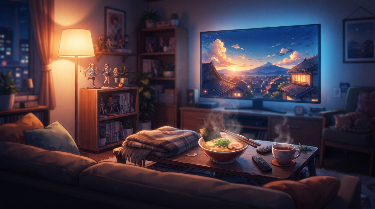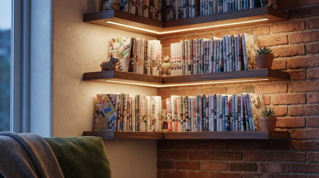
There is no physical address. The Manga Horizon studio is a set: a walnut shelf, a brick wall, a warm light strip—and one rule, always the same, applied to every one of our over 450 visuals. This article tells how this set is built, why every object is placed there, and how you can adopt these principles at home so your collection stops being just an alignment of objects and becomes a display case.
The essentials in brief
- A unique set featured across over 450 product pages: walnut, brick, warm grazing light
- The manga volumes of the character are systematically present in the background
- Objects pulled from the universe: a compass and chest for One Piece, stone lantern for Demon Slayer, hardbound books for Death Note
- A shallow depth of field that suggests a collection rather than an isolated product
- 6 reproducible principles for your own shelf, detailed at the end of the article
Table of Contents
- 1. A set, not an address
- 2. Wood and brick: why no white background
- 3. The manga volume rule
- 4. Objects that tell the story of the universe
- 5. Grazing light
- 6. Background blur
- 7. Labels and plaques
- 8. Composing your shelf: the 6 principles
- 9. Mistakes that ruin a beautiful shelf
- Frequently Asked Questions
1. A set, not an address
When opening a figure shop, the first temptation is to show products as suppliers do: isolated, on a black background, from every angle. It's clean, legible, and perfectly interchangeable—the same images circulate among hundreds of retailers.
We chose the opposite approach. Each piece in the catalog is presented in a set, always the same, with slight variations: a dark wood shelf, a brick or light plaster background, warm lighting, and a collection of objects chosen for the character's universe. This set has an internal name—the studio—and it follows a precise grammar that this article details.
The goal is not decorative. It is to answer the only question a buyer truly asks themselves when looking at a figure: what will this look like in my home?

2. Wood and brick: why no white background
A white background has one quality: it isolates. It shows the sculpture, the paint, the details, without anything to distract the eye. This is why we consistently keep at least one view of this type for each product page.
But it has a fatal flaw: it provides no scale. A 9 cm figure and a 45 cm piece look exactly the same on a neutral background. This is the primary cause of disappointment when receiving a package—not that the product is bad, but that it wasn't imagined that way. Compare a 9 cm piece like the chibi Nami and a large 38 cm diorama like the Luffy Gear 4 vs Kaido: on a neutral background, nothing distinguishes them.
Walnut was chosen for its warm neutrality: it makes the saturated colors of the figures pop without competing with them. Brick, whether red or painted light, provides texture that gives substance to the background without drawing the eye. Above all, both are living room materials: they place the figure in a real interior, not a catalog layout.

3. The manga volume rule
This is the studio's strictest constraint, and the one that is noticed the least: every scene aligns the manga volumes from which the character originates. The orange volumes of Naruto, the red and black spines of Death Note, the Hunter × Hunter covers with their crosses.
This rule serves three purposes at once. It provides scale: a manga volume is about 18 cm, everyone has held one, and the eye compares it instantly. It provides context: you know which series the piece is from without reading the title. And it provides credibility: a figure surrounded by the volumes of its series looks like a collection, not inventory.
It is a principle directly applicable at home, and it is probably the most rewarding step in this entire article: display your figures in front of your manga, not in a separate cabinet.

4. Objects that tell the story of the universe
Each universe has its vocabulary of objects. These are what transform a shelf into a scene. The choice is never decorative: every object must be justifiable by a scene from the manga.
| Universe | Set Objects | What they evoke |
|---|---|---|
| One Piece | Compass, telescope, chest, rope, treasure map | Navigation and treasure hunting |
| Naruto | Konoha headband, shuriken, scroll | Ninja equipment |
| Demon Slayer | Stone lantern, bonsai, petals, incense burner | Taishō era Japan |
| Death Note | Hardbound books, architect lamp, apple | Light's desk and L's obsession |
| Attack on Titan | Map of Paradis, lantern, leather | The wall and the expedition |
| Haikyū | Ball, pennant, net | The gym |
The internal rule is simple: maximum three objects per scene. Beyond that, the eye no longer knows where to rest and the figure—which is the subject—becomes just another element.


These sets are found behind every piece in the relevant collections: One Piece figures, Naruto figures, or Demon Slayer figures.
5. Grazing light
All our scenes use the same setup: a light strip mounted under the shelf above, which illuminates the figure from above and slightly from the front. This is what is called grazing light.
It does two things that no other lighting does as well. It defines the volumes: the folds of a coat, the strands of hair, the muscles of a torso only exist because of the shadows they cast. And it warms the colors: a temperature around 2,700 to 3,000 Kelvins gives paintings a depth that daylight flattens.
The opposite trap is the overhead light. Illuminated from above, a figure receives all the light on its skull and shoulders, and its face—the point everyone looks at first—falls into shadow.
For luminous pieces, the logic is reversed: the object becomes the source and the set darkens to leave room for it, as seen on the Ace Devil Fruit LED lamp.

6. Background blur
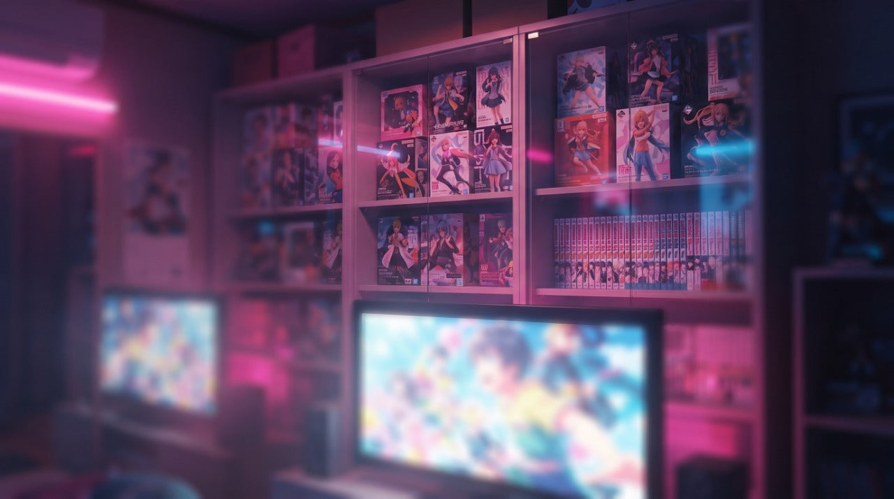
Look at any of our visuals: behind the sharp figure, you can guess at other pieces, blurred, out of focus. This is not a composition accident; it is the heart of the setup.
A figure alone on an empty shelf tells of a purchase. A sharp figure in front of twenty blurred silhouettes tells of a collection—and therefore a project, a continuity, something that started before and will continue after. This is what a collector feels in front of their own display case, and it is what we seek to evoke even before the purchase.
Technically, the effect comes from the depth of field: a large aperture, and a subject distanced from its background. The portrait mode of a recent smartphone provides a very decent approximation.

7. Labels and plaques
On some scenes appears a detail borrowed from museums: a small engraved label, placed in front of the piece, bearing the character's name. It is a nod, but it has a real effect—it treats the figure as an exhibited object rather than merchandise.
This detail also serves as a warning for those who want to imitate it. A misspelled label, or one that announces something other than what it describes, instantly discredits the whole scene. If you place them at home, double-check them: it is the first element the eye will read.

8. Composing your shelf: the 6 principles
Everything above can be transposed without any special equipment. Here are the six rules, in the order they produce the most effect.
- Back your figures with your manga. It's free, immediate, and what changes the most. The spines provide scale, color, and context.
- Light from above and towards the front. An adhesive LED strip under the top shelf, in warm white. Count about fifteen euros to transform an entire shelf.
- Group by universe, not by size. A One Piece shelf, a Naruto shelf. Collections mixed by format look like a store aisle.
- Add two or three objects, never more. A chest, a compass, a scroll. The object must exist in the work, otherwise it rings false.
- Leave some air. A piece needs empty space around it to exist. A saturated shelf cancels out the effect of every figure on it.
- Vary the heights. A transparent stand, a stack of books, a small display: three different levels are enough to create rhythm. Small formats like chibi figures benefit immensely from being elevated.
9. Mistakes that ruin a beautiful shelf
- Overhead lighting alone. It crushes faces and eliminates the shadows that provide depth.
- The bare white wall. A plain wall behind colorful figures creates a harsh contrast without substance. A simple panel of wood or adhesive brick is enough to correct it.
- Rigid alignment. Pieces perfectly aligned at regular intervals read like a commercial display. Offset them, turn them slightly, vary the depths.
- Mixing scales without transition. A 45 cm piece next to a 9 cm chibi crushes the small format. Separate them, or use an intermediate level.
- Cold light. Beyond 4,000 Kelvins, flesh tones turn gray and reds lose their intensity.

And the most costly mistake, the one you don't see immediately: direct sunlight. A figure exposed to full daylight behind a window loses its colors in a few months. Our guide on how to display and maintain manga figures details the protections to put in place, from UV filters to a dusting routine.
Frequently Asked Questions
Where is the Manga Horizon studio located?
The Manga Horizon studio is not an address: it is our reference set, the one you see on every visual in the shop. A walnut shelf, a brick or light plaster wall, a warm light strip, and the volumes of the manga in question. This visual grammar is the same from the first page to the last.
Is the set included with the figure?
No. The shelves, books, lanterns, chests, and objects visible in our visuals are only used to place the piece in its universe. Each caption specifies this with the mention "set not included." You receive the figure, its base, and the accessories listed on the product page.
Why not present figures on a white background?
The white background shows an object; the set shows a place. A 25 cm figure placed on a neutral background says nothing about what it will become in your home, whereas a shelf with manga volumes behind it instantly provides scale, atmosphere, and use. We still keep one isolated view on every page to judge the sculpture itself.
How deep should a shelf be to display figures?
Count on 25 to 30 cm of depth to comfortably accommodate 20 to 35 cm pieces with their bases, and 35 to 40 cm of free height between two shelves for large formats. Any lower, and the figures touch the shelf above and lose all breathing room.
How do you get that blur effect behind the figures?
That is depth of field. On a camera, it is obtained with a large aperture (f/1.8 to f/2.8) and by distancing the subject from the background. On a smartphone, portrait mode gives a similar result. The principle matters more than the gear: what is sharp catches the eye, what is blurred provides context.
What lighting should be used to highlight a collection?
Warm, grazing light, placed above and slightly in front of the pieces. LED strips mounted under each shelf are the simplest solution: they define the volumes without washing out the colors. Avoid frontal lighting, which flattens textures, and cold neon lights, which turn skin tones blue.
How can I showcase my figurines?
Just like in a studio: a textured background (wood, brick, dark fabric) rather than a white wall, warm light coming from above and slightly to the side, a little depth behind the piece to create a blur, and only one "star" figurine per shot. Everything else—shelving, height, maintenance—is in our guide to displaying and maintaining your figurines.
Going further
Our collections — browse our manga figurines, chibi figurines, One Piece figurines, or Hunter × Hunter figurines — and, to decorate the space around your pieces, our manga decor and goodies.
Some pieces to display — the Shanks vs. Mihawk diorama, the 22 cm Killua Zoldyck Lightning, the L Lawliet chibi figurine, the 15 cm Nezuko Demonic Awakening, or the Naruto eating ramen chibi.
Read next — our complete guide to displaying and maintaining your figurines, which covers protection, cleaning, and storage.